library(choroplethr)
library(choroplethrMaps)

data(df_pop_county)
county_choropleth(df_pop_county)
choroplethr was designed to make it as easy as possible to do exploratory data analysis of demographic data using choropleth (i.e. color-coded) maps.
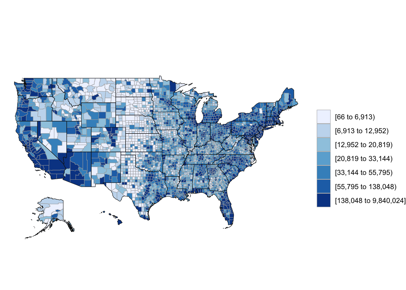
As an example, let’s use choroplethr to explore the built-in dataset ?df_pop_county, which has 2012 county-level population estimates. We will create the map using ?county_choropleth.
choroplethr defaults to using 7 quantiles. This means that there are 7 unique colors, and an equal number of counties are assigned to each color.
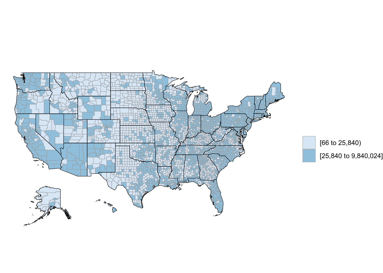
If you use two quantiles, you can see which counties have above or blow the median population:
library(choroplethr)
library(choroplethrMaps)

data(df_pop_county)
county_choropleth(df_pop_county, num_colors=2)
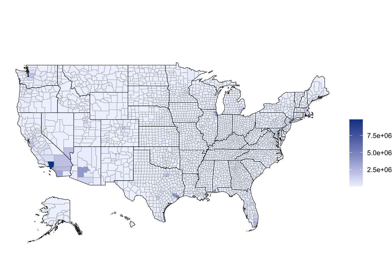
Using a continuous scale for the colors makes it easy to detect outliers. You can do that by setting num_colors=1:
library(choroplethr)
library(choroplethrMaps)

data(df_pop_county)
county_choropleth(df_pop_county, num_colors=1)
To learn more take the free class Mapmaking in R with Choroplethr